


Content, Content, Content…
Content is such an important factor in any media campaign. You want to attract customers and keep them interested. What you say can be almost as important as how you say it. Outdoor Advertising is no different.
Outdoor has its obvious limitations as well as tremendous benefits. The greatest limitation is that you have only a brief amount of time to convey your message to drivers as they maneuver through traffic. The greatest benefit is the ability to reach that same captive audience day after day at a strategic position in the market. How do we marry the two together? How do we reach our audience with an effective design using Outdoor Advertising? As the old saying goes…’Content is King’.
Simple is better; make it big, bold and easy to read. Leave them with a single impression. Outdoor is like a first date…the more you talk about yourself the less interesting you are. Drivers have very little time to be distracted and studies show that the more you put on an outdoor ad, the less likely people are to read it.
For example, let’s start with a basic layout:
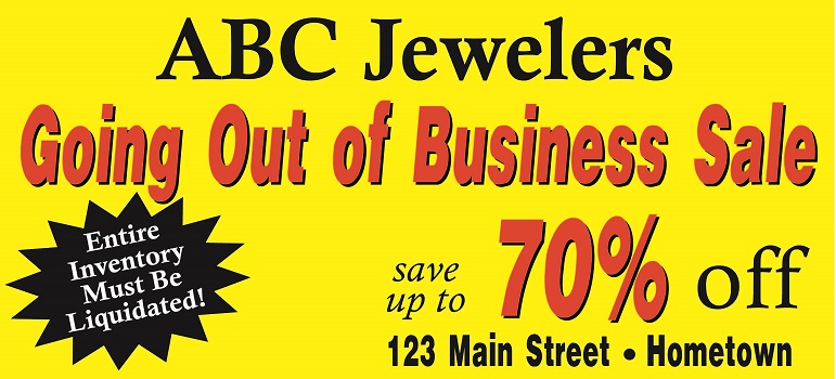
This is a strong, simple message. However, some advertisers feel that certain items cannot go unmentioned. The following is an example of the progression in the design process with some clients. To start with, an advertiser may feel strongly about how long they’ve been in business so they add the year they were founded:
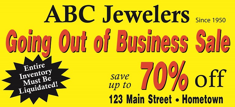
We haven’t made a major change so let’s keep it. However, not everybody may know where 123 Main Street is so we should make it easier to find us by mentioning that we are next to Wal-Mart.
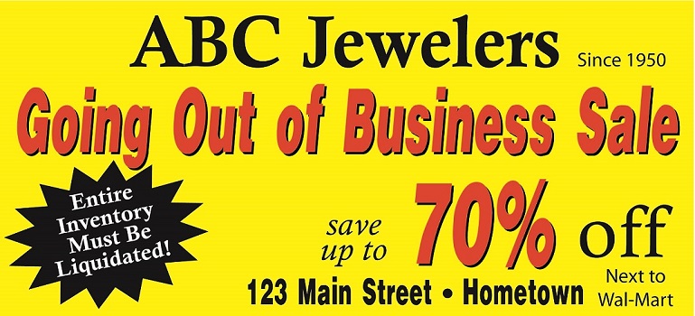
Wait…somebody might drive by and want to call us. Let’s make that easy and put our phone number on the board:
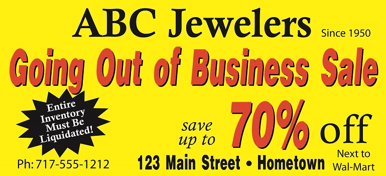
Now that I think about it, we can’t let people think that everything in the store is 70% off so let’s mention that our sale does not include certain items:
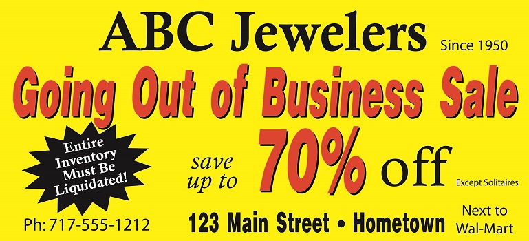
During the sale, we can increase the level of interest and attract them with an extra incentive to come into the store:
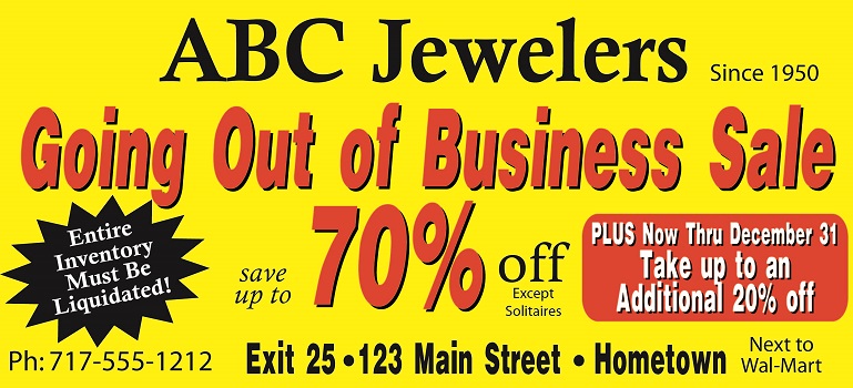
For one final push, let’s give them some urgency to come in to our event:
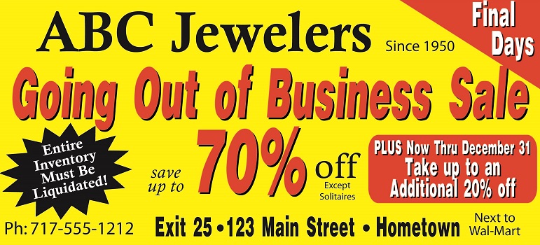
What started out as a simple, strong, attractive ad with a bold message has become so complicated that it will be far less likely to be read by drivers, and therefore far less effective.
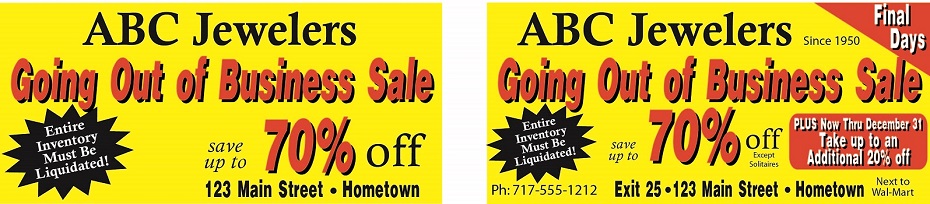
We’re not saying you can’t add these extras; just try to limit your campaign design to only the most important message. A great design is not one that says everything, but one that has nothing left that can be removed; so stay with four or fewer elements (name, address, copy line & location, for example.) People will find you; they will find your phone number; by using ‘up to’ after ‘save’ you have already excluded certain items. If you aren’t sure whether you’ve included too much in your design, make a print of it on a simple sheet of paper. Tape it to the wall, take 4-5 steps away, look away from the design and then look back for just five seconds. What you see in that limited amount of time is what drivers see when passing the board.
Make it big, bold and simple and your ad will be effective.